

O A K & V I N E
brand design / brand growth
Oak & Vine Wealth Management, LLC, hired Straight Creative to develop their Brand Design as well as manage their Brand Growth. Deliverables included a Brand Identity, Website, Marketing Materials, and continued maintenance. This project took 6 months.
THE PROBLEM
When Eric Hallin, founder of Oak & Vine Wealth Management, broke away from the corporate sector, he was struck by the low quality of and drab appearance of small financial firms. He desired to stand out from his competitors through stellar branding and website presentation in a way that would spark his potential client’s creativity and desire for relationship. In order to remain true to his roots in San Luis Obispo, CA, Eric decided to name his new boutique financial firm Oak & Vine as a tribute to the local symbols.
THE SOLUTION
When we discussed the brand design for Oak & Vine, it was clear that we needed to highlight the name because of its personal importance to Eric. Playing off of his desire to have a branding that was creative and welcoming as opposed to technical and drab, we chose a warm color palette reminiscent of San Luis Obispo, CA; a serif typeface for his logo to remain crisp and professional; and an icon symbol that creatively combined the oak and vine by utilizing negative space (and which highlighted the ampersand because, according to Eric, the ampersand is a “sexy” symbol!).
COLOR PALETTE
The color palette to a brand identity is one of the building blocks to the brand as it will be utilized everywhere. Color has important psychological implications and so choosing the right colors for a brand is incredibly important; selecting colors both relevant to the brand and that incite the right psychological response becomes a balancing act.
RUST #A65B3C
Meaning: Pride
OAK #364336
Meaning: Virtue
GRAPE #31173A
Meaning: Luxury
EARTH #2B1211
Meaning: Security
SUNSHINE #DDC276
Meaning: Success
CREAM #FEFBE2
Meaning: Humility
TYPOGRAPHY
The typography used in a Brand Identity is just as important as the color palette. It’s what is used 100% of the time in the logo design and should subtly reflect the personality of the brand. The accent font supports the primary font.
LOGO VARIATIONS
Logo variations are used depending on space restrictions. Good practice is to use the primary logo whenever possible. However, logo variations such as the Submark are created with Social Media profile dimensions in mind while the Mark or Icon are great for small restricted sizes such as the website favicon.
Primary Logo
Secondary Logo
Logo Submark

Brand Icon Pattern
Logo Mark
ICONS
Custom icons are used on the website and on social media. Icons are a huge modern branding technique because they attract the viewer’s attention a lot more quickly than an image and especially a text due to their simplicity.


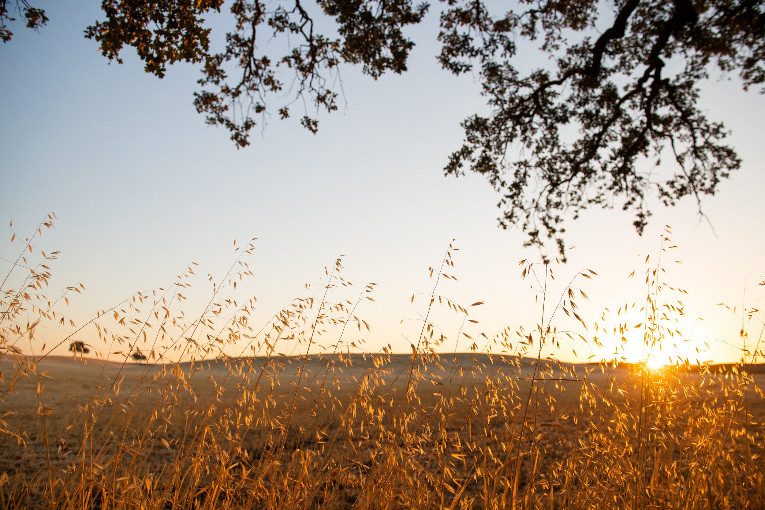
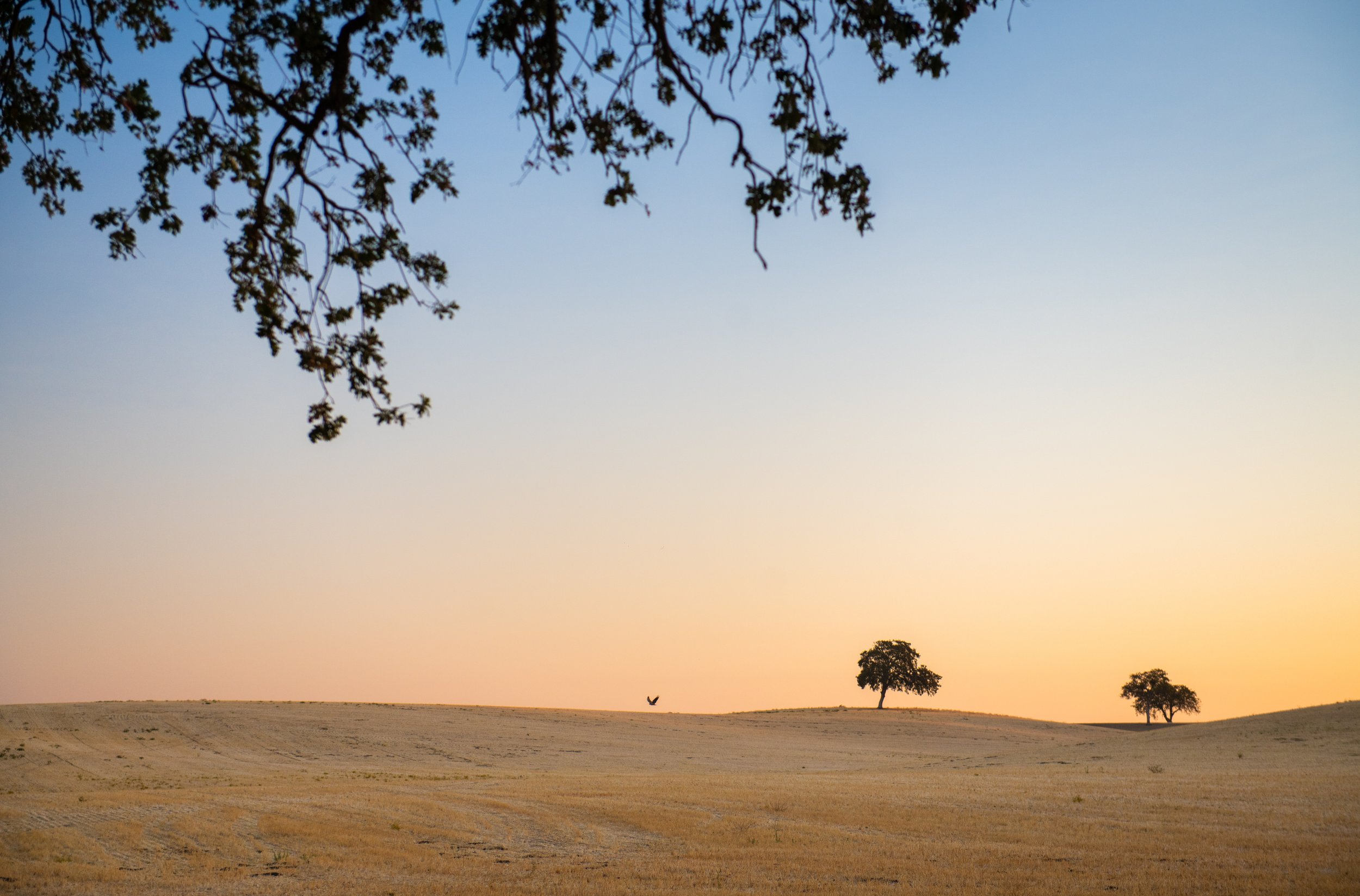
PHOTOGRAPHY
Whether your photos are custom-taken or carefully selected stock photos, it’s crucial that they’re professional, applicable, and cohesive.


WEBSITE
A study done by Stanford found that 75% of people base the credibility of your business on how your website looks. What this means is that — even if you offer a better service! — if your competition has the better website than they are more likely to get the business. CLICK TO VIEW WEB PAGE.


BUSINESS CARD
Some say that physical business cards are dead… But what they forget about is the power of something tangible. We took Oak & Vine’s Branding and applied it to a business card design, then had them printed on plastic!

LAUNCH DAY GRAPHICS
Having special graphics for your brand launch day is a great advertising strategy.


MOCKUPS
Mockups show clients the potential that their brand has. When Eric saw the mockups at the end of the brand presentation he excitedly said, “Now I have to order some polos!”


